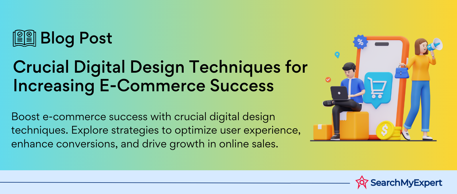
Crucial Digital Design Techniques for Increasing E-Commerce Success
Digital Design for E-commerce
Defining Digital Design: Scope and Importance in E-commerce
Digital design in the realm of e-commerce is an intricate tapestry, weaving together visual aesthetics, user experience (UX), and technical functionality to create an online shopping environment that not only appeals to the eye but also facilitates ease of use and efficient customer journeys. It's a digital storefront that speaks volumes about a brand, shaping first impressions and influencing purchasing decisions.
The Vitality of Digital Design in E-commerce
- First Impressions Matter: The initial encounter a customer has with your e-commerce site can make or break their decision to continue browsing or bounce off. Digital design sets the tone.
- Enhanced User Experience: Good design is not just about looks; it's about how easily a user can navigate your site, find what they're looking for, and complete a transaction without friction.
- Brand Identity: Your website's design is a reflection of your brand's identity and values. It's a visual communication tool that conveys who you are to your audience.
- Conversion Optimization: Effective design leads to better user engagement, lowering bounce rates, and increasing conversion rates. It's about turning visitors into customers.
- Adapting to Trends: Digital design trends are ever-evolving. Staying current is crucial for maintaining relevance and competitiveness in the market.
The E-commerce Landscape: Understanding Customer Behavior and Trends
E-commerce has transcended from being just a convenient shopping alternative to a dominant market force. Understanding customer behavior and trends in this digital era is pivotal for tailoring design strategies that resonate with your audience.
Key Aspects of Customer Behavior in E-commerce
- Mobile Dominance: With an increasing number of users shopping on mobile devices, designing for mobile-first is no longer optional but a necessity.
- Personalization: Customers expect a tailored shopping experience. Utilizing data to personalize design elements can significantly enhance user engagement.
- Social Proof: Incorporating elements like reviews and ratings within the design can influence purchasing decisions and build trust.
- Speed and Accessibility: A fast-loading, easy-to-navigate site is crucial for keeping the modern, time-pressed consumer engaged.
- Security Concerns: Design elements that reassure customers about the security of their data can greatly influence their willingness to complete a purchase.
E-commerce Trends Influencing Design
- Augmented Reality (AR): Integrating AR into e-commerce design allows customers to have a more immersive and interactive experience.
- Sustainability and Ethics: Displaying a brand's commitment to sustainability and ethical practices through design can appeal to the values of contemporary consumers.
- Voice Search Optimization: As voice searches become more common, designing for voice search compatibility is an emerging necessity.
Building Brand Identity
Visual Storytelling: Crafting a Unique Brand Message Through Design
In the digital marketplace, your brand's identity is its heartbeat. It's not just about logos or colors; it's about telling a story that resonates with your audience, crafting a narrative that engages and captivates. This is where visual storytelling in e-commerce design plays a pivotal role.
The Art of Visual Storytelling
- Imagery That Speaks: Choosing images that align with your brand's values and message. It's not just what you sell, but the story behind it.
- Consistency Across Platforms: Maintaining a consistent visual narrative across all digital platforms, from your website to social media.
- Engaging Layouts: Designing layouts that guide the user through your story, creating an immersive experience that goes beyond the transactional.
- Interactive Elements: Utilizing interactive design elements to engage users actively, making them a part of your brand's story.
Logo, Typography & Color Palettes: Establishing an Impactful and Consistent Visual Identity
Your logo, typography, and color palette are the cornerstones of your brand's visual identity. They are the first elements that catch a user's eye and are instrumental in making your brand memorable.
Logo: The Face of Your Brand
- Simplicity and Memorability: A great logo is simple, distinctive, and memorable. It should encapsulate your brand's essence at a glance.
- Versatility: Your logo should be adaptable to various mediums and sizes, from tiny mobile screens to large billboards.
Typography: The Voice of Your Brand
- Consistency: Consistent use of typography reinforces your brand's personality. Whether it's modern, traditional, or quirky, your font speaks volumes.
- Readability: Beyond aesthetics, your typography should be easily readable across devices and contexts.
Color Palettes: The Emotion of Your Brand
- Psychology of Colors: Colors evoke emotions. The right color palette can create a mood, convey a message, and influence perceptions and behaviors.
- Brand Recognition: Consistent use of color increases brand recognition by up to 80%. It's a subtle yet powerful tool for embedding your brand in customers' minds.
Website Design Principles
User Interface (UI) and User Experience (UX): Prioritizing Intuitiveness and Ease of Navigation
In the digital design domain, UI and UX are the yin and yang that create a harmonious user journey on an e-commerce website. They are the silent ambassadors of your brand, shaping how users interact with your site and forming lasting impressions.
User Interface (UI): The Visual Interface
- Clarity and Simplicity: A clean and intuitive UI makes navigation effortless, helping users find what they need without confusion.
- Consistent Design Elements: Consistency in buttons, fonts, and colors enhances usability and reinforces brand identity.
- Responsive Design: Ensuring your website is visually appealing and functional across all devices is non-negotiable in today's mobile-first world.
User Experience (UX): Beyond the Visual
- Seamless Navigation: A well-thought-out UX design guides users effortlessly from the homepage to checkout, enhancing user satisfaction.
- Load Speed: A fast-loading website is crucial for a positive UX. Even a few seconds delay can lead to increased bounce rates.
- Feedback and Interaction: Interactive elements like hover effects and feedback for user actions (like adding a product to the cart) enrich the user experience.
Information Architecture: Structuring the Website for Optimal Product Discovery and Purchase Flow
Information Architecture (IA) is the blueprint of your website. It's about organizing content in a way that's logical, accessible, and beneficial to the user's journey.
Effective Information Architecture Strategies
- Intuitive Categorization: Products should be categorized in a way that's intuitive to the user, reducing the effort required to find a specific item.
- Search Functionality: A robust search feature with filters and suggestions can significantly enhance product discovery.
- Clear Call-to-Action (CTA): CTAs should be strategically placed to guide users towards making a purchase, signing up for newsletters, or other desired actions.
- Streamlined Checkout Process: A simplified checkout process, with clear instructions and minimal steps, is vital for converting browsers into buyers.
Product Page Optimization
High-Quality Visuals: Compelling Product Photography and Videography
The power of high-quality visuals on a product page cannot be overstated. They are the frontline soldiers in capturing customer interest and driving sales. In a digital shopping environment, where customers can't physically interact with products, compelling photography and videography bridge the gap.
The Impact of High-Quality Visuals
- Photography: Clear, high-resolution images from multiple angles give customers a detailed view of the product.
- Videography: Product videos can provide a real-life demonstration, enhancing understanding and trust.
- 360-degree Views: Interactive visuals that allow customers to see the product from all angles can significantly enhance engagement.
- Zoom Functionality: Allowing customers to zoom in on details can mimic the in-store experience of examining a product closely.
Engaging Content: Product Descriptions, Specifications, and Reviews
The content on your product page is your sales pitch. It's where you answer questions, address concerns, and highlight the benefits of your product.
Crafting Engaging Content
- Descriptions: Must be clear, concise, and highlight key features and benefits. They should speak to your target audience's specific needs and desires.
- Specifications: Detailed specifications help customers understand exactly what they're getting, reducing uncertainty and potential returns.
- Reviews: Customer reviews add a layer of social proof, increasing trust and credibility.
Calls to Action (CTAs): Clear and Strategically Placed Buttons for Conversion
CTAs are the signposts on the road to conversion. They guide users towards taking the desired action, be it adding a product to the cart, proceeding to checkout, or any other.
Effective CTAs
- Visibility: CTAs should stand out on the page and be easy to locate.
- Clarity: The message should be clear and concise. Users should know exactly what will happen when they click.
- Strategic Placement: Place CTAs at points where users are most likely to be convinced to make a purchase.
Mobile Optimization
Responsive Design: Adapting the Website for a Seamless Experience on All Devices
In the current digital era, where mobile internet usage has surpassed desktop, responsive design is not just an option; it's a necessity. Responsive design ensures that your e-commerce website adapts fluidly across different screen sizes and devices, offering a seamless and consistent experience to all users.
Key Aspects of Responsive Design
- Fluid Grids: Use flexible grid layouts that resize and adapt to any screen size.
- Flexible Images: Ensure images scale correctly within the fluid grid, maintaining quality and aspect ratio.
- Media Queries: Use CSS media queries to apply different styles for different devices, enhancing usability on various screens.
Mobile-First Approach: Prioritizing the Mobile User Experience
A mobile-first approach means designing the website for mobile devices first before scaling up to larger screens. This approach acknowledges the growing prevalence of mobile browsing and aims to optimize the experience for mobile users.
Implementing a Mobile-First Strategy
- Simplified Navigation: Streamline navigation for smaller screens, making it easy for users to find what they need with minimal clicks.
- Touch-Friendly Design: Design for touch interaction with larger, easy-to-tap buttons and intuitive scrolling.
- Fast Loading Speeds: Optimize for faster loading on mobile devices, considering factors like data usage and connectivity.
- Prioritize Key Content: Determine what content is most important for mobile users and make it readily accessible.
Performance and Analytics
Website Speed and Optimization: Ensuring Fast Loading Times for Enhanced User Satisfaction
Website speed is a crucial factor in user satisfaction and SEO ranking. In the fast-paced digital world, users expect quick and responsive websites. Slow loading times can lead to increased bounce rates and lost sales opportunities.
Optimizing Website Speed
- Image Optimization: Compress and optimize images to reduce loading times without compromising quality.
- Minimize HTTP Requests: Reduce the number of elements loaded on each page to decrease loading time.
- Use of Content Delivery Networks (CDNs): CDNs store your site's assets on multiple servers around the world, reducing the load time for users regardless of their location.
- Browser Caching: Implement browser caching to store some data on the user's device, speeding up the loading process for repeat visitors.
Tracking User Behavior: Utilizing Analytics Tools to Understand User Journeys and Improve Conversions
Understanding how users interact with your site is critical for optimizing their experience and boosting conversions. Analytics tools provide valuable insights into user behavior, preferences, and pain points.
Leveraging Analytics for E-commerce
- Traffic Sources: Identify which channels bring the most traffic and conversions, helping to optimize marketing strategies.
- User Engagement: Track metrics like time on site, pages per session, and bounce rate to gauge user engagement and identify areas for improvement.
- Conversion Tracking: Monitor conversion rates to understand what drives sales and where users drop off during the buying process.
- Customer Segmentation: Use data to segment customers and tailor experiences based on their behavior and preferences.
Staying Ahead of the Curve
Design Trends and Innovation: Integrating the Latest Design Elements for a Modern and Competitive Storefront
In the dynamic world of e-commerce, staying relevant means keeping up with the latest design trends and innovations. A storefront that evolves with the times not only appeals to modern consumers but also demonstrates a brand's commitment to providing the best shopping experience.
Embracing Design Trends and Innovations
- Minimalism: A trend focusing on simplicity and functionality, stripping away unnecessary elements to create a clean and focused user experience.
- Interactive Elements: Incorporating interactive elements like animations, hover effects, and dynamic content to engage users.
- AI and Personalization: Utilizing AI to offer personalized experiences, such as product recommendations based on user behavior.
- Sustainability: Design elements that showcase a brand's commitment to sustainability resonate with environmentally conscious consumers.
A/B Testing and Experimentation: Continuously Testing and Refining Design Elements for Optimal Results
A/B testing is a powerful tool in the e-commerce design toolkit. It involves comparing two versions of a web page to see which performs better. This continuous process of testing, analyzing, and refining helps in making data-driven design decisions.
Implementing A/B Testing for Design Refinement
- Test Design Variations: Experiment with different layouts, color schemes, and CTAs to see what resonates best with your audience.
- Measure Performance: Use metrics like conversion rates, click-through rates, and time on page to evaluate performance.
- Iterative Process: Implement the winning elements and continue testing to refine and improve the user experience.
Conclusion
Staying ahead in the e-commerce space means continuously innovating and adapting to new design trends and user expectations. By embracing cutting-edge design elements and employing A/B testing, you can create an online storefront that not only looks great but also delivers exceptional performance and user experience.
Transform your digital interactions with Digital Design Firms.
share this page if you liked it 😊
Other Related Blogs


Mastering Docker for App Development: A Comprehensive Guide to Benefits, Use-Cases, and Alternatives

STAY UP TO DATE
GET PATH'S LATEST
Receive bi-weekly updates from the SME, and get a heads up on upcoming events.
Contact Us

